.svg)
.svg)


Hello, this is WhaTap Labs!
February brings a lot of changes to WhaTap, and today we'd like to introduce the second one!
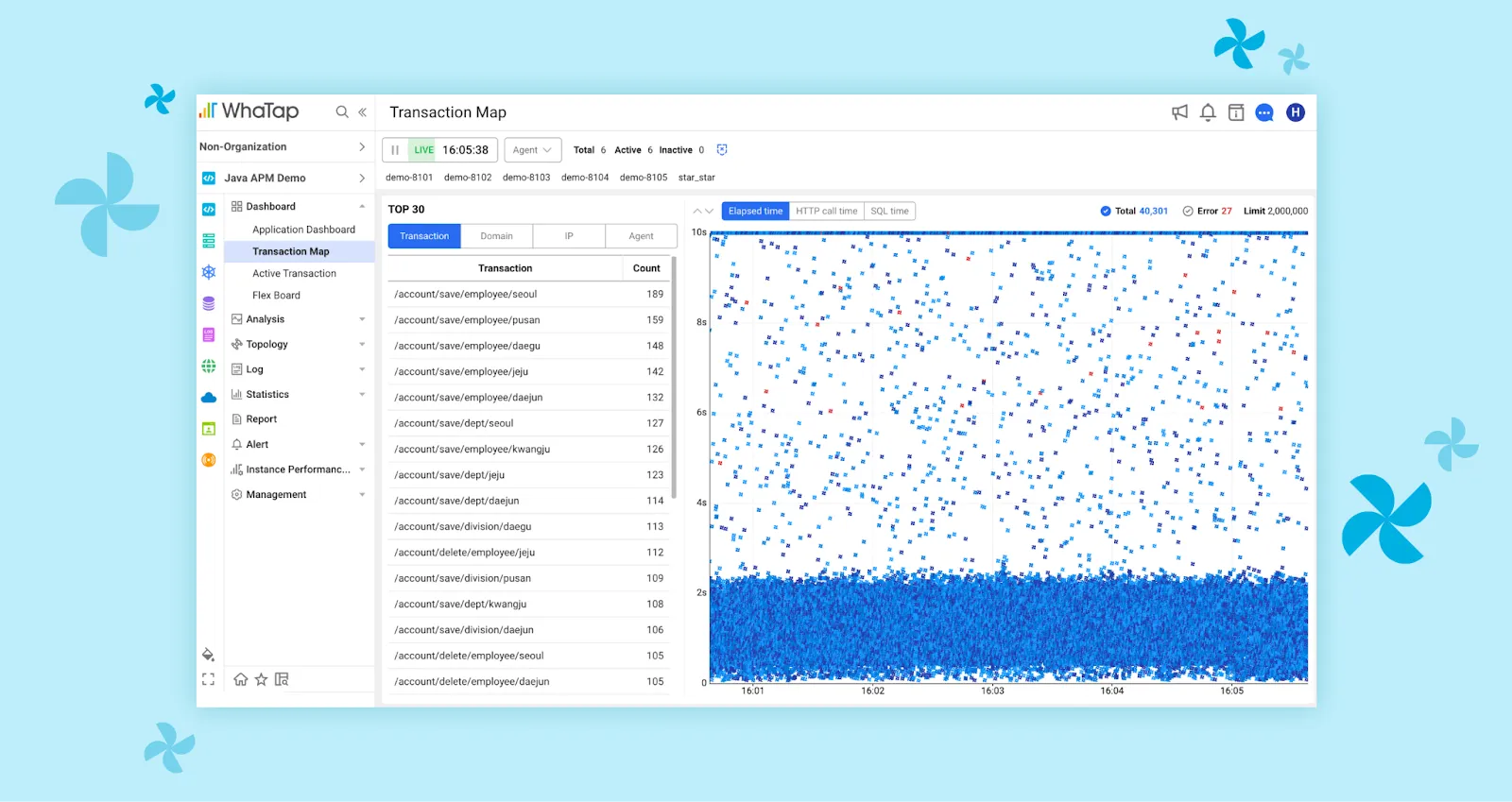
📍What is the difference between a heatmap and a transaction map?
A heatmap chart is a density representation of the number of transactions over a specific interval, with darker colors for more transactions and lighter colors for fewer transactions. In the case of heatmaps, transaction distribution information is organized by intervals, so you can see trends over relatively long periods of time. However, because transactions are aggregated and displayed in 5-second increments, it is difficult to understand the distribution of individual transactions.
We recommend using heatmaps to analyze the distribution of large numbers of transactions over a long period of time, and transaction maps to get a detailed view of short-term transactions for performance testing, outages, and more!
Transaction maps have changed like this!
Filter feature that has become more meticulous and convenient
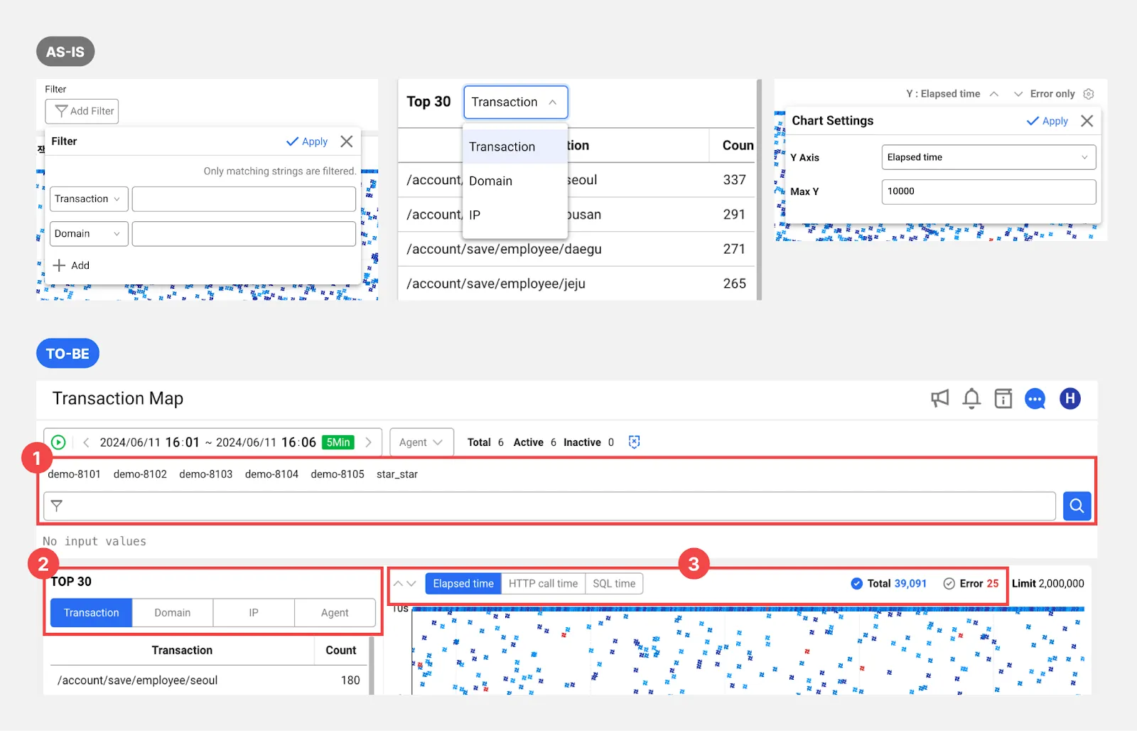
Before
Previously, using the filter function was cumbersome, requiring multiple button clicks. If you wanted to sort the top 30 by each category or change the y-axis of the chart, you would have to press each setting button and make additional selections.
After
We've reorganized the filters so that you can apply them from one screen, minimizing button clicks. Filter 1 can be used to look at a point in time in the past. For example, you can use the elapsed time filter to exclude transactions with short execution times from the chart, or the transaction filter to selectively view only selected transactions. Filters 2 and 3 have been changed to tab method for easy setup and can be used in both real-time and historical viewing.
An increase in the number of trace analysis
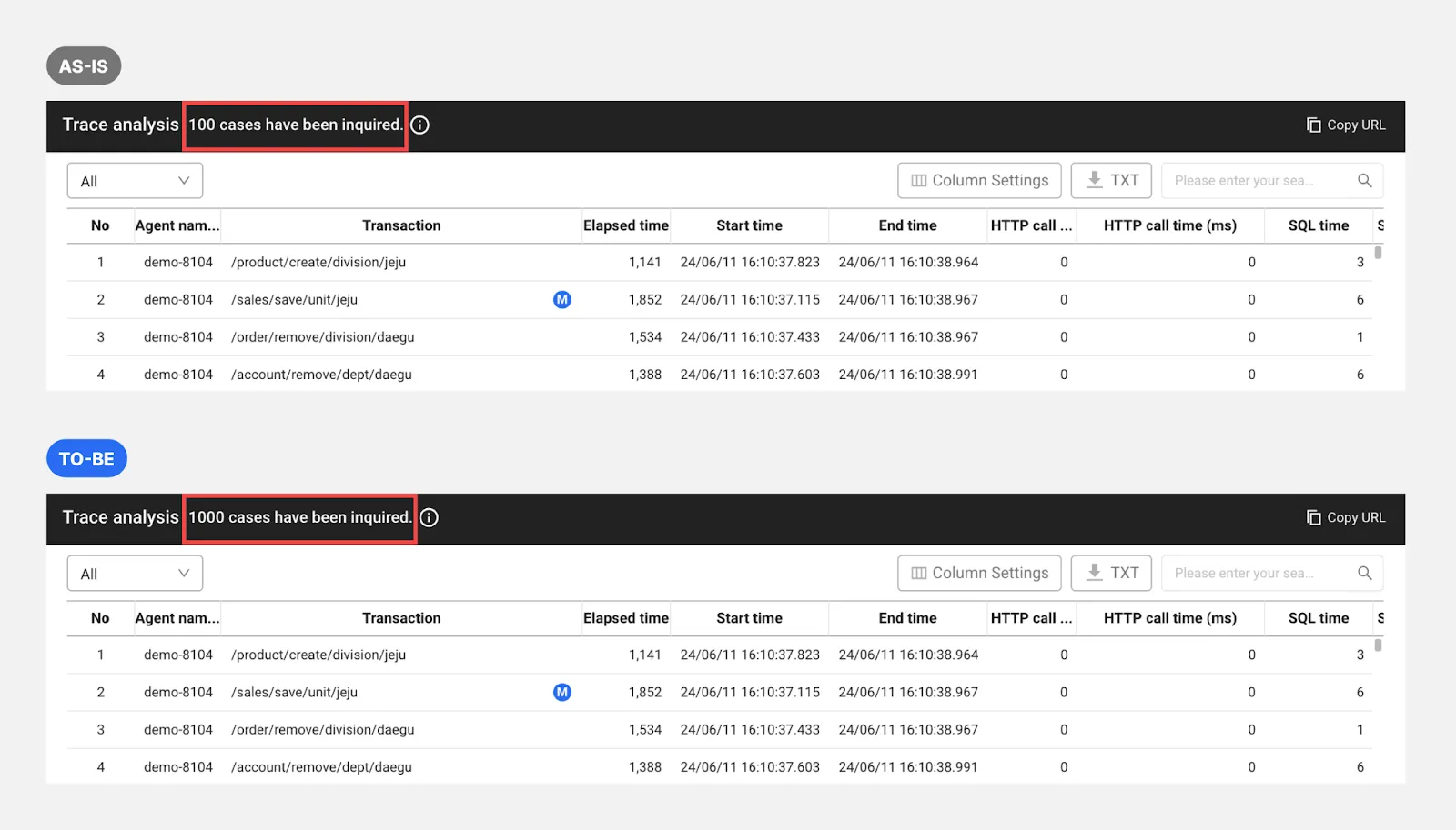
Before
Previously, up to 100 were displayed.
After
Up to 1000 are displayed. When looking for consistent patterns or distributions, we can analyze 10 times more traces than before.
Sneaky Tips to Copy if You Want to Look Like a WhaTap Expert🐝
Hidden keyboard event!
Once you select a filter value in the TOP 30 list, you can use the up and down arrows to change the selected value.
When you select a portion of the chart in the transaction map, you can use the up and down arrows to change the maximum value on the y-axis. (*Click with your mouse to make the first selection.)
What if you want to make multiple selections in the TOP30 list?
Press the control button (*command button on Mac) and select the items you want! You can make multiple selections.
If you have any questions, please feel free to contact us via chat or support channel and we will get back to you as soon as possible. Also, please feel free to share your experience with the new menu via the support channel. We will do our best to provide better service based on your feedback!


