.svg)
.svg)


Why?
In Developers in His 40s Making Charts 2 (https://www.whatap.io/ko/blog/27/), I mentioned a Grouped Bar Chart for tracking multi-server transactions.
When I drew that diagram, I wanted to differentiate between the information that maps to the left and right sides of the diagram to make it easier to see multiple pieces of information at a glance. As you can see below, we tried to visualize the calling relationships between individual application transactions on the left side, and the start, end, and elapsed time of the transactions processed by each application on the right side.
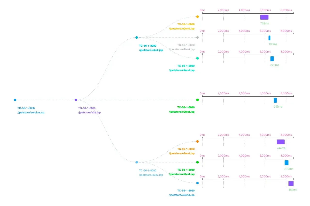
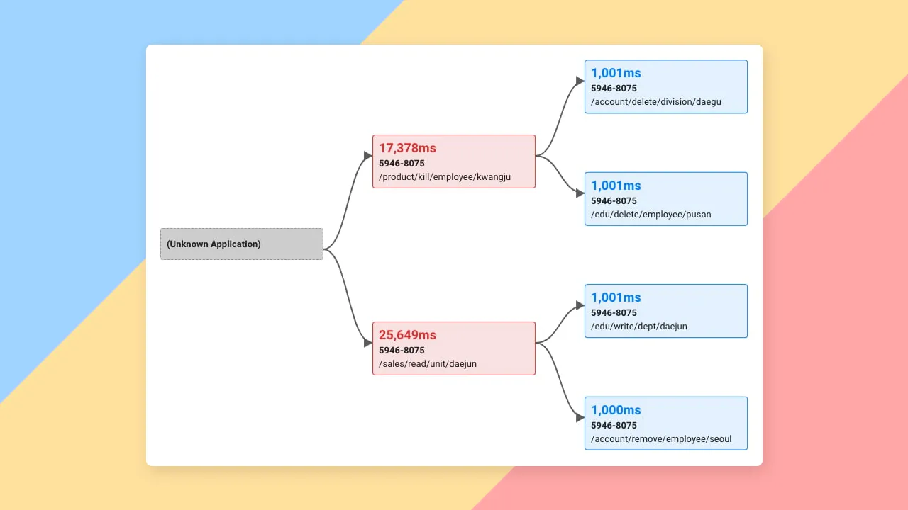
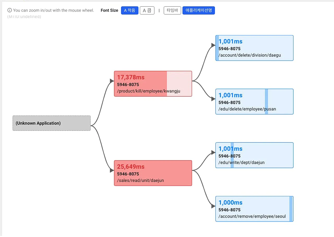
Figure 1. Diagram at the beginning of feature delivery
*마우스 휠로 확대 / 축소가 가능합니다. = *You can zoom in/out with the mouse wheel.
Figure 2. The diagram we used to present with a slight restyling.
We started to hear internal voices from users who were used to seeing this screen and complained that the chart was hard to see when it was displayed on a projector or pasted into a PT ledger.
We decided to use the power of WhaTap's jack-of-all-trades designers to listen to their complaints, incorporate their requirements, and reorganize them into a diagram that would be easier on the eyes.
The purpose?
The first question I received from WhaTap universal designers was, "What is this diagram for?" The intent of this question is to clearly separate what to emphasize from what not to emphasize.
The majority answer was that the call relationship information was the most important, and from my perspective as the creator of this diagram, neither the call relationship nor the start time and elapsed time of individual transactions were missing. However, the majority opinion was that since we can see the delays of individual transactions in the table view, we should focus on showing the relationships. I decided to give in and reorganize the diagram around the relationships.
Designer's comment
The previous proposal emphasized response time and timeline charts rather than relationships by removing unnecessary colors. As a result, lines were relatively weakly represented, and the flowchart was hard to see because the lines were buried. In response to these and other requirements, the purpose of this improvement is as follows.
- Diagram Chartview should show relationships first - emphasize lines
- The first information users want to find is "slow response time" - highlight slow response time in color, starting with slowest response time
- Depth representation is clear up to 4depths - divide the grid by depth to lay out information
- More concise representation so that when there is a lot of information represented in a depth, it is not space inefficient to represent the information - Show time bar charts in a boxed background area
The result?
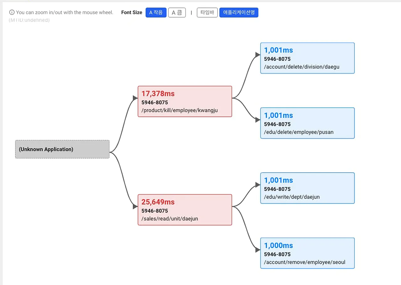
Below is the result after the reorganization. See what's different? When you look at the screen with the defaults, there is nothing dramatically different.
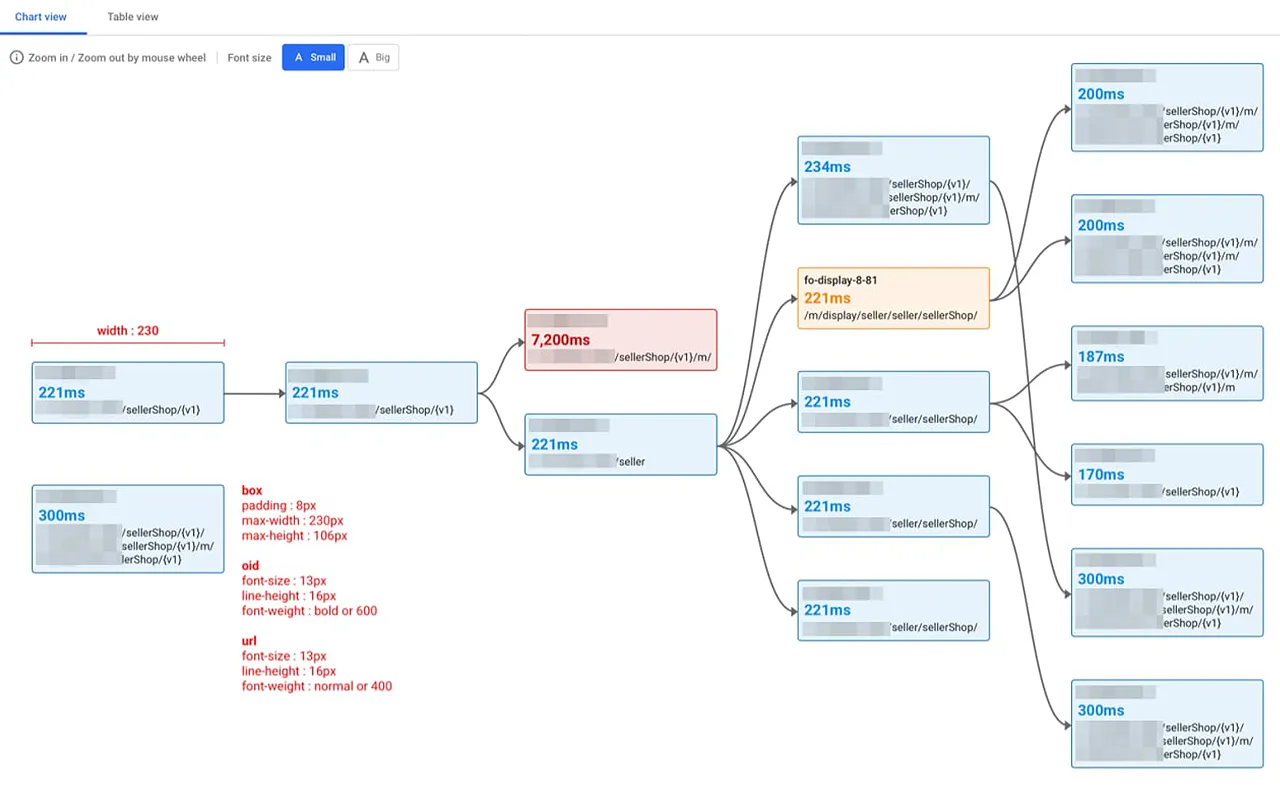
The relationship lines have been highlighted to make them stand out, and any delays in each application transaction are now shown in the card background color and border color, instead of just highlighting the elapsed time.
The elapsed time representation, which the team objected to, was solved with an add-on via a button ("Timebar").
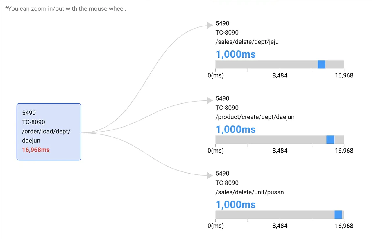
This is what it looks like when you click the timebar button The width of each node in the diagram is the total response time of the entire transaction, with a highlighted background color indicating the period from the start time to the end time of that application transaction.
Wrapping up
The mockup we received from the designer looked like this, with a very deep case in mind.
It started out as an overhaul to make the diagrams easier on the eyes, but we have added a little bit of developer ambition to it because we did not want to abandon the feature we already had. We hope you will find the revamped charts much easier to read.


